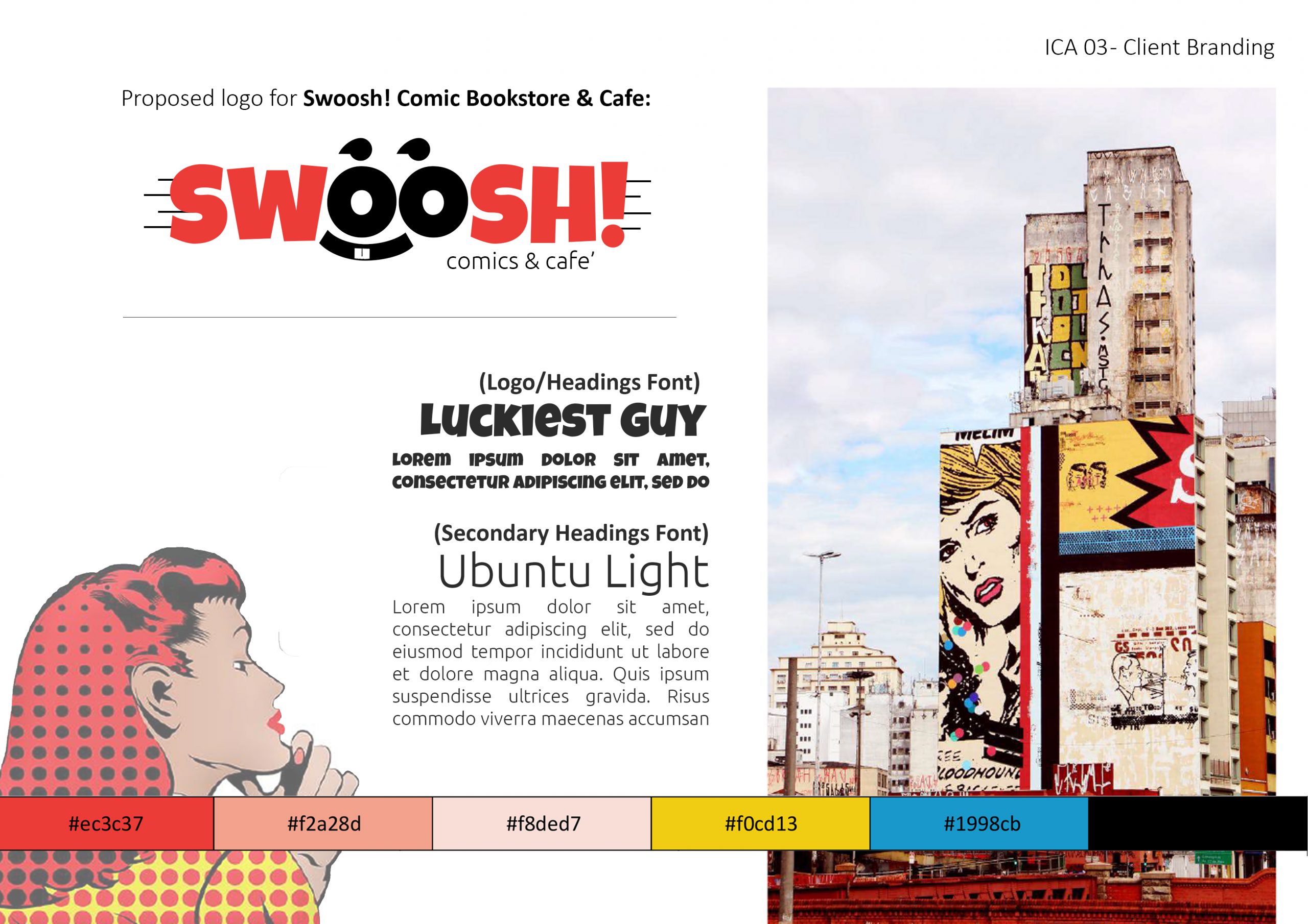
Swoosh!
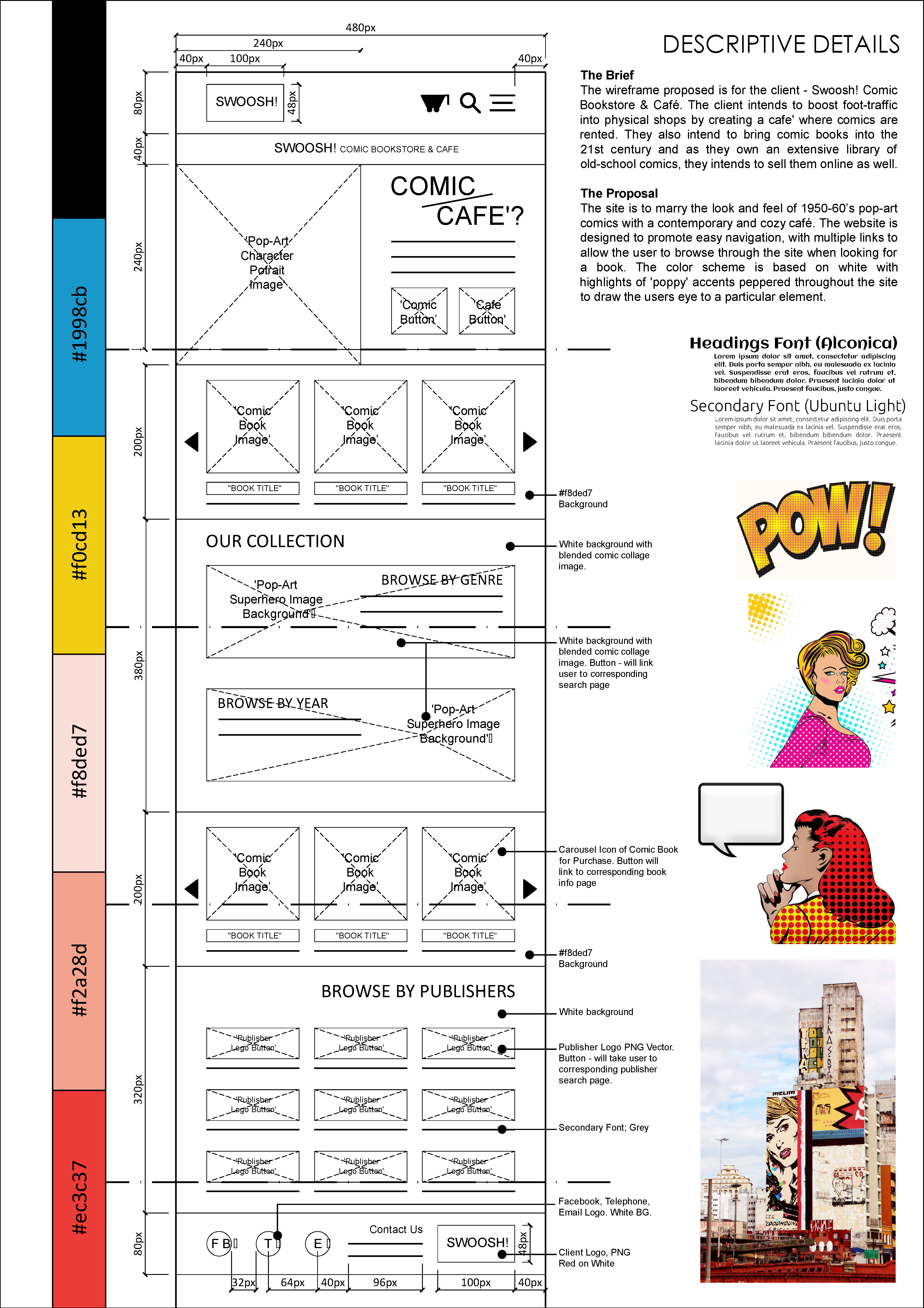
The design proposed is for the client – Swoosh! Comic Bookstore & Café. The client intends to boost foot-traffic into physical shops by creating a café where comics are rented. The branding of Swoosh was designed to imitate the look and feel of 1950-60’s pop-art comics and merging it with a contemporary and cozy café.
Branding & Identity Design
Color Swatch:
#EC3C37
#ffffff
Typography Swatch:
Luckiest Guy
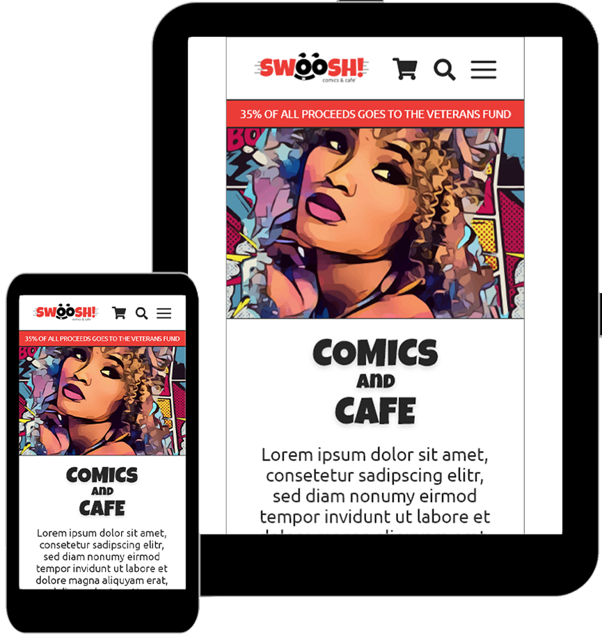
Prototype Design
Gallery