CAMIC/ACCAM
Canadian Association of Mutual Insurance Companies (CAMIC) is a non-profit mutual insurance collective of more than 150 mutual insurance companies across several provinces in Canada.
Branding & Identity Design
Color Swatch:
#ee4b22
#ADAEA8
Typography Swatch:
PT Sans
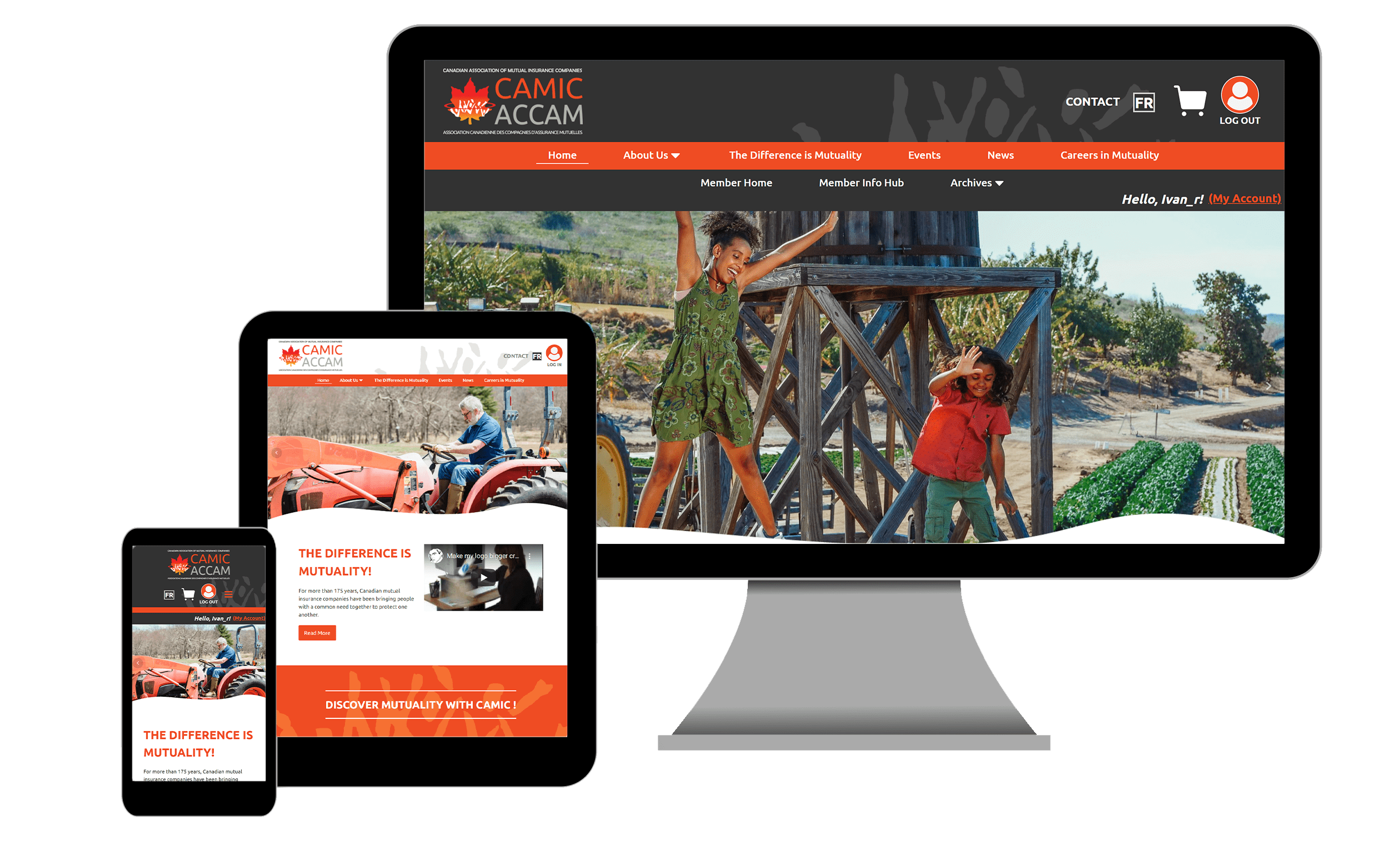
Website Screenshots
MOBILE (480px)

TABLET (720px)

DESKTOP (1080px)
Website Features
Bilingual Capabilities & User Access Control
The site uses WPML for English and French content and also securely manages different user roles, protecting member pages from public view
WooCommerce & Event Booking
The site features the ability for customers to securely purchase tickets to the client's events
Social Media Integration
The site allows the customers to keep in touch with the client's posts on social media

Gallery